


-
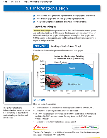
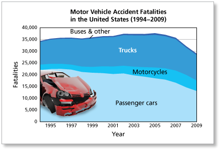
In a stacked area graph, the amount is represented by the difference between two line graphs. For instance, in the stacked area graph in Example 1 (shown below), you can estimate that there were about 10,000 truck fatalities in 1995.
-
Information graphics, or infographics, are commonly seen to display large amounts of data in an attractive and accessible way. Sites such as Daily Infographic and GOOD showcase many entertaining and interesting infographics for you to browse.
-
Use the data in the spreadsheet. You can compare motorcycle accident fatalities in 1994 and 2009 as numbers and percents.
Numbers:
In 1994, there were 2320 motorcycle accident fatalities. In 2009, there were 4462 motorcycle accident fatalities. There were about twice as many motorcycle accident fatalities in 2009 than in 1994.
Percents:
To compare motorcycle accident fatalities as percents, divide the number of motorcycle fatalities for the year by the total number of motor vehicle accident fatalities for the year.
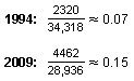
In 1994, motorcycle accident fatalities accounted for about 7% of motor vehicle accident fatalities. In 2009, motorcycle accident fatalities accounted for about 15% of motor vehicle accident fatalities.
-
These comments are not screened before publication. Constructive debate about the information on this page is welcome, but personal attacks are not. Please do not post comments that are commercial in nature or that violate copyright. Comments that we regard as obscene, defamatory, or intended to incite violence will be removed. If you find a comment offensive, you may flag it.
When posting a comment, you agree to our Terms of Use.
Find out on our blog: http://www.andyou.com/blog/math-in-the-news/math-in-the-news-information-design/