


-
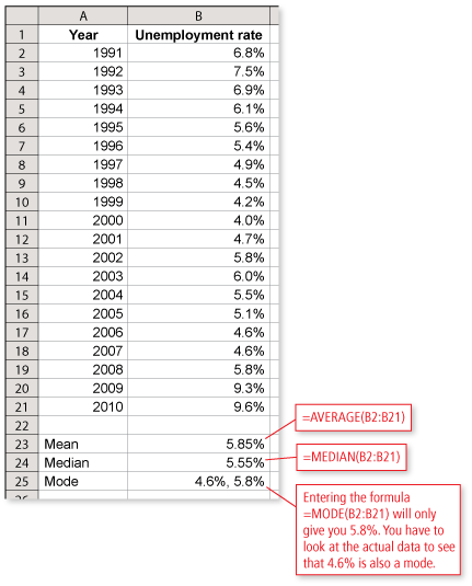
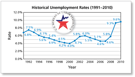
Using a spreadsheet and the line graph shown, what are the mean, median, and mode of the data presented in the line graph?

 Comments (0)
These comments are not screened before publication. Constructive debate about the information on this page is welcome, but personal attacks are not. Please do not post comments that are commercial in nature or that violate copyright. Comments that we regard as obscene, defamatory, or intended to incite violence will be removed. If you find a comment offensive, you may flag it.
When posting a comment, you agree to our Terms of Use.Showing 0 commentsSubscribe by email Subscribe by RSSThere are no comments. -
-
Using a spreadsheet and the line graph shown, which measure of central tendency best describes the average of the data? Explain your reasoning.
These comments are not screened before publication. Constructive debate about the information on this page is welcome, but personal attacks are not. Please do not post comments that are commercial in nature or that violate copyright. Comments that we regard as obscene, defamatory, or intended to incite violence will be removed. If you find a comment offensive, you may flag it.
When posting a comment, you agree to our Terms of Use. -
Which two data values in the line graph are outliers?
-
From the graph, you can see that the values of 9.3% in 2009 and 9.6% in 2010 are outliers because they are significantly greater than the other values in the graph.
These comments are not screened before publication. Constructive debate about the information on this page is welcome, but personal attacks are not. Please do not post comments that are commercial in nature or that violate copyright. Comments that we regard as obscene, defamatory, or intended to incite violence will be removed. If you find a comment offensive, you may flag it.
When posting a comment, you agree to our Terms of Use. -
-
Using a spreadsheet and the line graph shown, do the outliers have a greater effect on the mean or the median? Explain your reasoning.
These comments are not screened before publication. Constructive debate about the information on this page is welcome, but personal attacks are not. Please do not post comments that are commercial in nature or that violate copyright. Comments that we regard as obscene, defamatory, or intended to incite violence will be removed. If you find a comment offensive, you may flag it.
When posting a comment, you agree to our Terms of Use. -
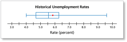
Use the box-and-whisker plot to analyze the unemployment rates.
-
Here are some observations you can make about the historical unemployment rates.
- About 25% of the data is between 4.0% and 4.7%.
- About 25% of the data is between 4.7% and 5.6%.
- About 25% of the data is between 5.6% and 6.3%.
- About 25% of the data is between 6.3% and 9.6%.
- The highest 25% of the data has the greatest range. The other 3 quarters have similar ranges.
These comments are not screened before publication. Constructive debate about the information on this page is welcome, but personal attacks are not. Please do not post comments that are commercial in nature or that violate copyright. Comments that we regard as obscene, defamatory, or intended to incite violence will be removed. If you find a comment offensive, you may flag it.
When posting a comment, you agree to our Terms of Use. -
-
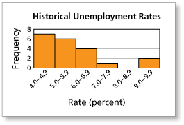
Explain whether the following statement is supported by the histogram: "The unemployment rate during most years is between 4.0% and 7.0%."
These comments are not screened before publication. Constructive debate about the information on this page is welcome, but personal attacks are not. Please do not post comments that are commercial in nature or that violate copyright. Comments that we regard as obscene, defamatory, or intended to incite violence will be removed. If you find a comment offensive, you may flag it.
When posting a comment, you agree to our Terms of Use.