


-
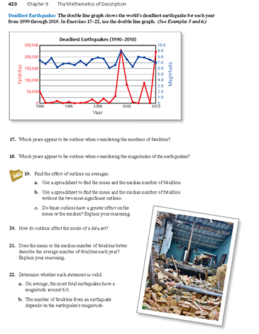
The double line graph shows the world's deadliest earthquake for each year from 1990 through 2010. Which years appear to be outliers when considering the number of fatalities? (See Example 5 and Example 6.)

-
To determine the years that are outliers, find the data values that are much larger than most of the other values.
In most years, the numbers of fatalities are under 40,000. The numbers of fatalities in 2004 and 2010 are much greater than this number and the numbers in 2005 and 2008 are also considerably greater than this number.
So, the most significant outliers for the numbers of earthquake fatalities occurred in the years 2004 and 2010. The numbers of earthquake fatalities in the years 2005 and 2008 may also be considered outliers.
Comments (0)These comments are not screened before publication. Constructive debate about the information on this page is welcome, but personal attacks are not. Please do not post comments that are commercial in nature or that violate copyright. Comments that we regard as obscene, defamatory, or intended to incite violence will be removed. If you find a comment offensive, you may flag it.
When posting a comment, you agree to our Terms of Use.Showing 0 commentsSubscribe by email Subscribe by RSSThere are no comments. -
-
The double line graph shows the world's deadliest earthquake for each year from 1990 through 2010. Which years appear to be outliers when considering the magnitude of the earthquakes? (See Example 5 and Example 6.)
These comments are not screened before publication. Constructive debate about the information on this page is welcome, but personal attacks are not. Please do not post comments that are commercial in nature or that violate copyright. Comments that we regard as obscene, defamatory, or intended to incite violence will be removed. If you find a comment offensive, you may flag it.
When posting a comment, you agree to our Terms of Use. -
The double line graph shows the world's deadliest earthquake for each year from 1990 through 2010. Find the effect of outliers on averages.
- Use a spreadsheet to find the mean and the median number of fatalities.
- Use a spreadsheet to find the mean and the median number of fatalities without the two most significant outliers.
- Do these outliers have a greater effect on the mean or the median? Explain your reasoning.
(See Example 5 and Example 6.)

-
- Use a spreadsheet to find the mean and median.
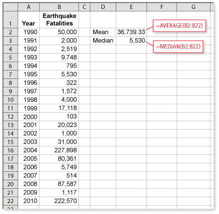
The mean is about 36,739 and the median is 5530.
- The years with the most significant outliers are the years with the greatest numbers of fatalities, 2004 and 2010. Use a spreadsheet to find the mean and median with the data for 2004 and 2010 removed.
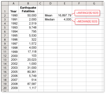
The mean is about 16,898 and the median is 4000.
- The outliers increase the mean from about 16,900 to about 36,700, an increase of nearly 20,000 and over 100%. The outliers increase the median from 4000 to 5530, an increase of 1530 and less than 40%. The outliers have a much greater effect on the mean than the median, both in terms of the number of fatalities and the percent of increase.
Because more than half of the data are grouped so closely together, removing the two outliers changes the middle value of the data to a number that is close to the original median. Because their values are so great, however, removing the outliers has a substantial effect on the mean.
- Use a spreadsheet to find the mean and median.
These comments are not screened before publication. Constructive debate about the information on this page is welcome, but personal attacks are not. Please do not post comments that are commercial in nature or that violate copyright. Comments that we regard as obscene, defamatory, or intended to incite violence will be removed. If you find a comment offensive, you may flag it.
When posting a comment, you agree to our Terms of Use. -
The double line graph shows the world's deadliest earthquake for each year from 1990 through 2010. How do outliers affect the mode of a data set? (See Example 5 and Example 6.)
These comments are not screened before publication. Constructive debate about the information on this page is welcome, but personal attacks are not. Please do not post comments that are commercial in nature or that violate copyright. Comments that we regard as obscene, defamatory, or intended to incite violence will be removed. If you find a comment offensive, you may flag it.
When posting a comment, you agree to our Terms of Use. -
The double line graph shows the world's deadliest earthquake for each year from 1990 through 2010. Does the mean or the median number of fatalities better describe the "average" number of fatalities each year? Explain your reasoning. (See Example 5 and Example 6.)
-
Sample answer:
From Exercise 19, the mean is about 36,739 and the median is 5530. Comparing these values to the data in the line graph, the median is close to the majority of the data, while the mean is greater than most of the data. So the median is probably the better average for the data.
Keep in mind that the context of the situation usually helps to determine the best average for the data. For instance, to predict the approximate number of fatalities in the deadliest earthquake for a randomly selected year, the median is probably the most helpful average. The mean, however, is the only average that you could use to determine the total number of fatalities shown in the line graph.
These comments are not screened before publication. Constructive debate about the information on this page is welcome, but personal attacks are not. Please do not post comments that are commercial in nature or that violate copyright. Comments that we regard as obscene, defamatory, or intended to incite violence will be removed. If you find a comment offensive, you may flag it.
When posting a comment, you agree to our Terms of Use. -
-
The double line graph shows the world's deadliest earthquake for each year from 1990 through 2010. Determine whether each statement is valid. (See Example 5 and Example 6.)
- On average, the most fatal earthquakes have a magnitude around 6.0.
- The number of fatalities from an earthquake depends on the earthquake's magnitude.
These comments are not screened before publication. Constructive debate about the information on this page is welcome, but personal attacks are not. Please do not post comments that are commercial in nature or that violate copyright. Comments that we regard as obscene, defamatory, or intended to incite violence will be removed. If you find a comment offensive, you may flag it.
When posting a comment, you agree to our Terms of Use.