


-
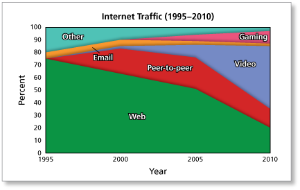
The vertical axis on the left of the figure shown in Example 2 (also shown below) lists the proportion of total Internet traffic for a household in 1995. In 1995, 75% of the traffic was Web, 5% was Email, and 20% was Other. The vertical axis on the right lists the proportion of the total Internet traffic in 2010. In 2010, 20% of the traffic was Web, 15% was Peer-to-peer, 50% was Video, 2% was Email, 10% was Gaming, and 4% was Other. (Note that the sum of these values is not 100% due to rounding.)
-
Wondering what the difference is between a bit and a byte? Visit How Stuff Works for more on these information storage units.
-
Sample answer:
The stacked area graph shows that Web traffic has decreased as a proportion of total Internet traffic for a household since 1995, but it does not show whether the actual volume of Web traffic has increased or decreased since 1995. So, you cannot conclude that the household's Web usage has declined.
-
These comments are not screened before publication. Constructive debate about the information on this page is welcome, but personal attacks are not. Please do not post comments that are commercial in nature or that violate copyright. Comments that we regard as obscene, defamatory, or intended to incite violence will be removed. If you find a comment offensive, you may flag it.
When posting a comment, you agree to our Terms of Use.
http://boingboing.net/2010/08/17/is-the-web-really-de.html