


-
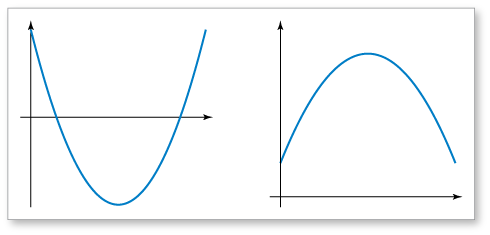
The graph of the curve in Example 2(b) is parabolic and is called a parabola. In general, parabolas are U-shaped graphs, as shown in the figures. When graphing a model based on real-life data, you might only see part of the "U."
-
Oil isn't the only thing that pollutes the oceans. Litter, fishing line, and other debris also cause problems for marine life. To find out how you can help, visit KeepOceansClean.org.
-
Use a spreadsheet to make a scatter plot and column graph.

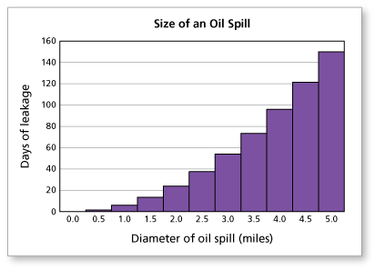
Sample answer:
I think the scatter plot shows the data the best because it makes it easier to visualize the relationship between the size of the oil spill and the number of days. Also it's easier to imagine a curve fitting those data points and using it to predict future data.
-
Comments (0)
These comments are not screened before publication. Constructive debate about the information on this page is welcome, but personal attacks are not. Please do not post comments that are commercial in nature or that violate copyright. Comments that we regard as obscene, defamatory, or intended to incite violence will be removed. If you find a comment offensive, you may flag it.
When posting a comment, you agree to our Terms of Use.Showing 0 commentsSubscribe by email Subscribe by RSSThere are no comments.