


-
The U.S. federal revenue from individual income taxes for the years 1991 through 2010 are shown in the figure.
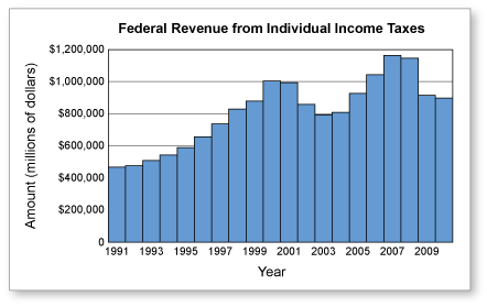
To investigate earlier years (or other sources of federal revenue), you can use the historical tables at the Office of Management and Budget.
-
If you are interested in learning more about information design, you might want to check out The Information Design Handbook, which was co-authored by two design veterans, Jenn and Ken Visocky O'Grady.
-
Use a spreadsheet to draw both graphs.

-
Sample answer:
-
Sample answer:
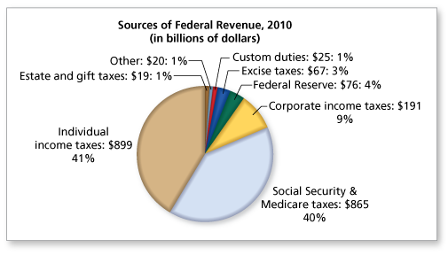
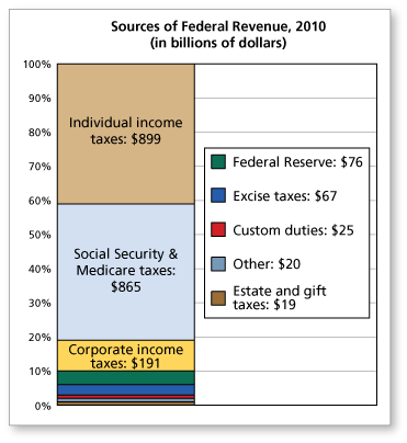
I prefer the circle graph. It shows more data and is more intuitive when considering parts of a whole.
-
-
Comments (0)
These comments are not screened before publication. Constructive debate about the information on this page is welcome, but personal attacks are not. Please do not post comments that are commercial in nature or that violate copyright. Comments that we regard as obscene, defamatory, or intended to incite violence will be removed. If you find a comment offensive, you may flag it.
When posting a comment, you agree to our Terms of Use.Showing 0 commentsSubscribe by email Subscribe by RSSThere are no comments.